TwinCAT HMI is very powerfull tool in the world of industrial automation as you can change many many things in the editor but there are still some limitations. Have you ever thought “Damn! I wish to change look of this but there is no option in editor!”. If you did you just came to the right place!
We will have a short look at how to work with themes and then we will learn how to apply custom CSS that can by applied in the editor using the system of theme classes and to change looks of anything including the things you cannot change standard way in WYSIWYG editor.
Table of Contents
- What you can change right away in editor
- Creating custom Theme class
- Custom classes in theme editor
- How to use Theme classes on controls.
- Custom CSS for custom theme classes
- Changing CSS of default TwinCAT Controls
- Changing unchangeable
- Final word
- Example file
What you can change right away in editor
So first let’s open Themes and have a look what are the available options here. In Solution Explorer navigate to your HMI project -> Themes -> Select theme you want to edit.
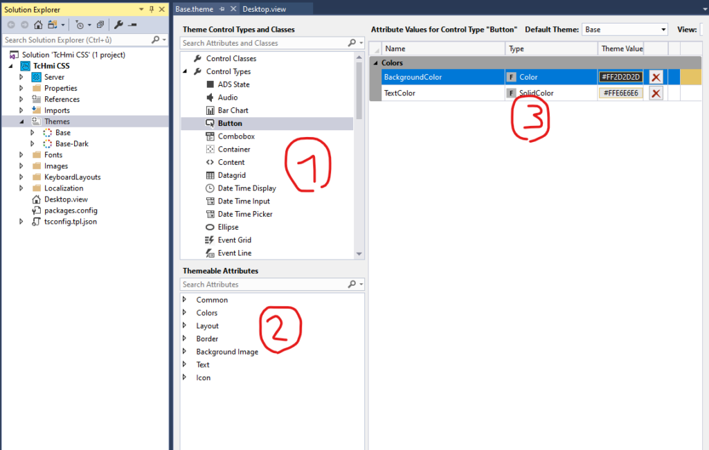
You will see list of HMI build-in controls (1) and after selecting one of them the list of their attributes (2) will show-up under them. Double click the attribute or drag’n’drop it into the right side (3) to change their default values.
This will change default looks of the controls. Most of the visual properties which can be found in the control Properties pane can be found here. If you wish to change attributes which are not listed here you can do so using CSS as written few paragraphs later.
Creating custom Theme class
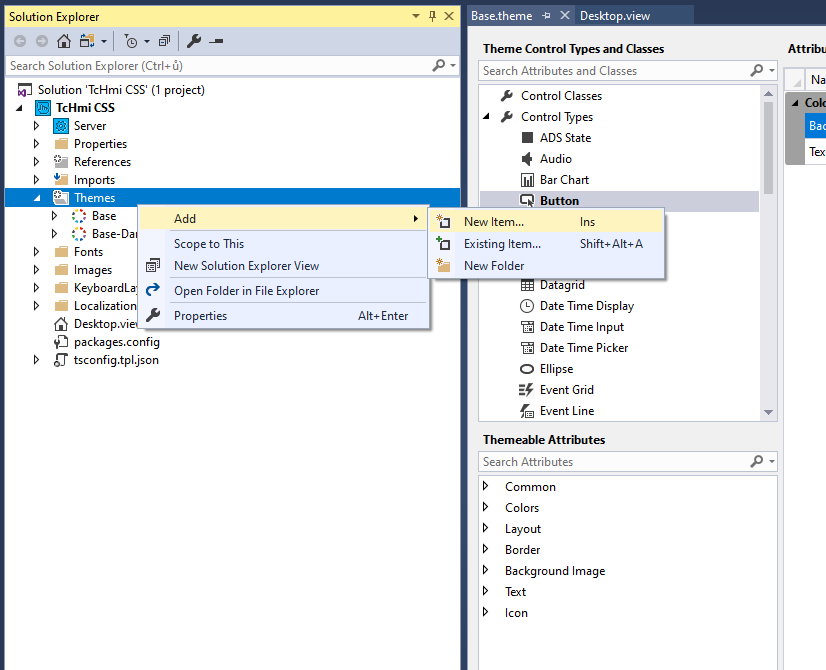
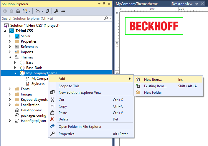
Before changing anything, let’s leave this Base theme as it is and create our own theme which we will edit. Go to Themes -> Add -> New Item… and select Theme and give it some name (you will probably name it by your company or customer as some customer may require special visuals).
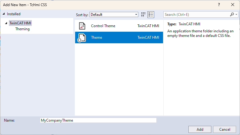
The option Control Theme will come in handy later in the tutorial.
Now set our newly created theme as default. Open any theme and at the top of the window there is selection of Default Theme. Choose the one we just created.
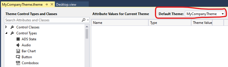
*Default theme can be also changed in project properties.
Custom classes in theme editor
So we have got our own theme now. Open it and at the top of the Theme Control Types and Classes list there is a Control Classes category. Right click on it and select Create new Control Class.
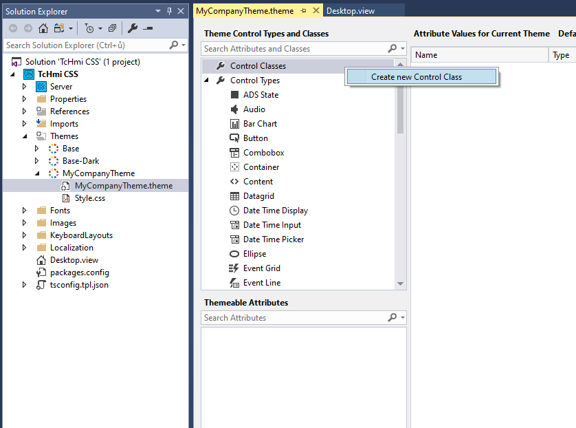
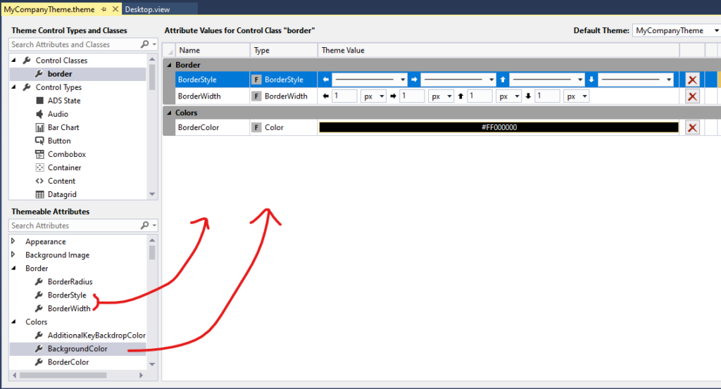
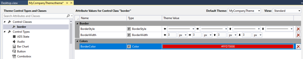
Let’s make an example where we predefine border that can be used on any control. Let’s change its name by clicking on it. Then select desired variables from the list bellow and change them as in the following picture.
How to use Theme classes on controls.
Now we have some ready to use classes. So let’s have a look on how to apply them.
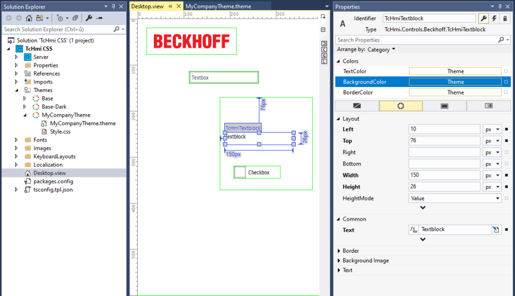
We will start by placing few controls on the screen. It may be whatever (the attributes we set in the theme editor will apply on any control that has those attributes/properties).
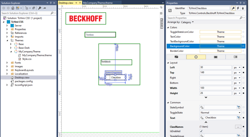
Then select some control and show Properties window.
You can not see themes or classes or anything at first. You have to uncover hidden options by that little arrow at the end of each category. We are searching for the ClassNames in the Common category.
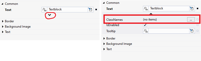
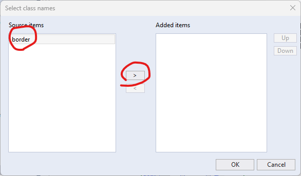
Click that “…” button and the window for adding classes to your control will show up. Select all the classes (in our case we have just border class) you want to apply on this element and click the arrow in the middle to add them. Then hit OK.
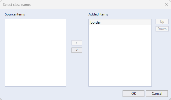
Do this for all your elements where you want to add the border or any class you make. All your elements should now have border.
When you want to change how border should look you only have to change the class in the theme editor and Save the change. It will update automatically.
Creating classes is easy and will save you a lot of time when you want to style your controls in same fashion as opposed to changing properties of each individual control.
*As ClassNames is just another property you can also change it inside an event.
Custom CSS for custom theme classes
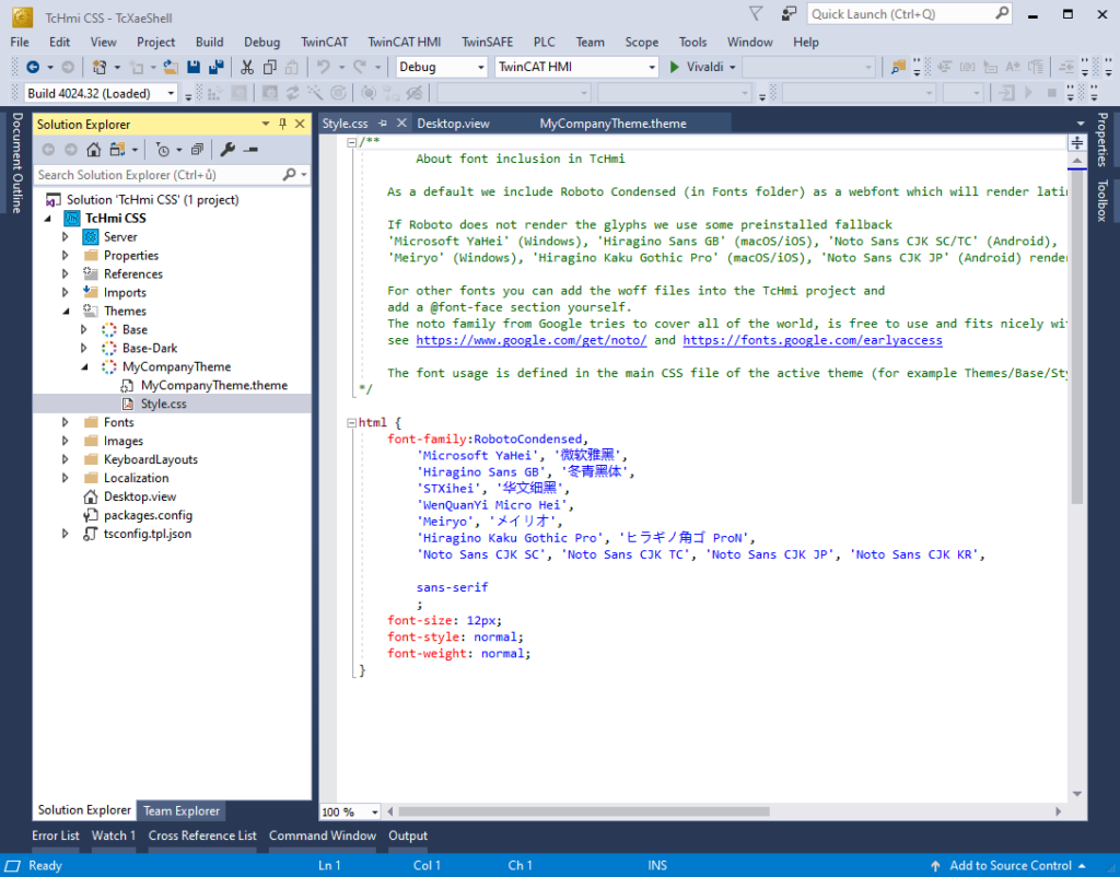
Applying custom CSS gives you many possibilities which can be even completely unreachable in theme editor. First we will have to know where to write those CSS rules. Right next to file of your theme you have probably noticed there is a file Styles.css which is exactly what we are looking for. Open the file and you can start to write custom CSS.
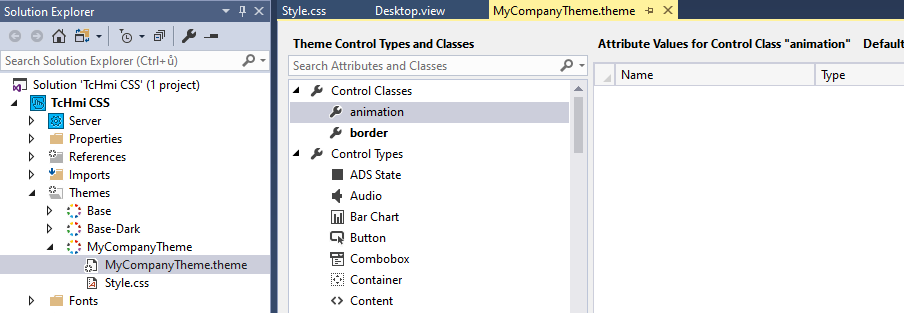
Before you start to style everything you should know the name of the class you want to style. So let’s first create new theme class and name it “animation“.
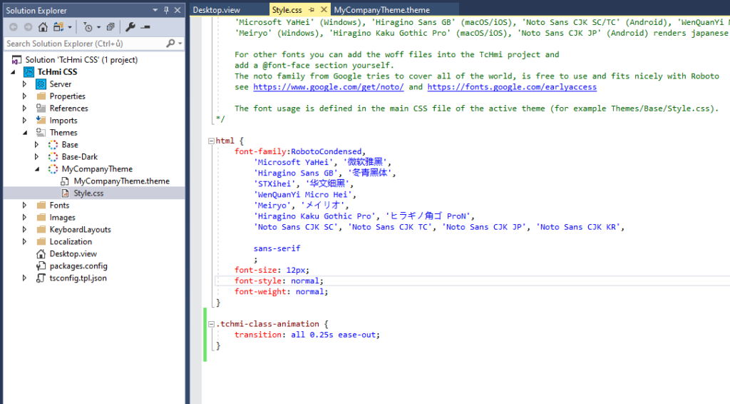
To change CSS of theme class you have to prefix its name with tchmi-class as shown bellow.
Also notice that all CSS classes are prefixed with dot.
This class will cause 0.25 s long animated transition for all position or dimension changes. You can find more details about it on https://www.w3schools.com/css/css3_transitions.asp or anywhere on the interwebs.
.tchmi-class-animation {
    transition: all 0.25s ease-out;
}
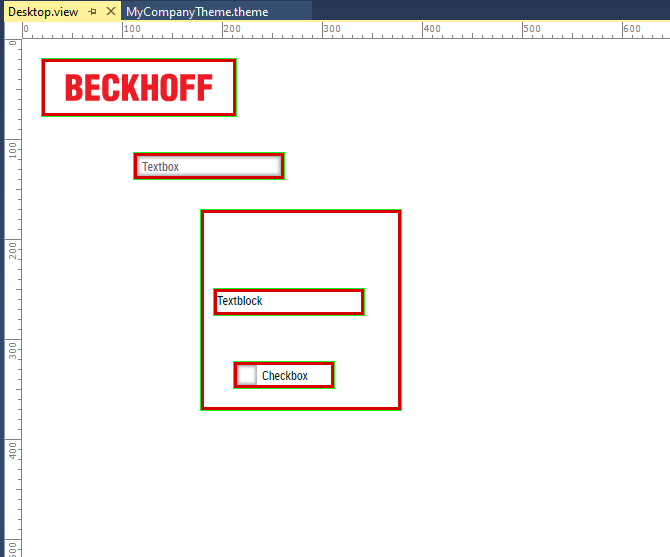
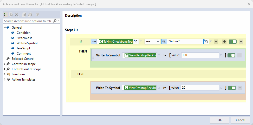
So let’s test whether it really does something. On the Desktop create checkbox and add an .onToggleStateChanged event to it.
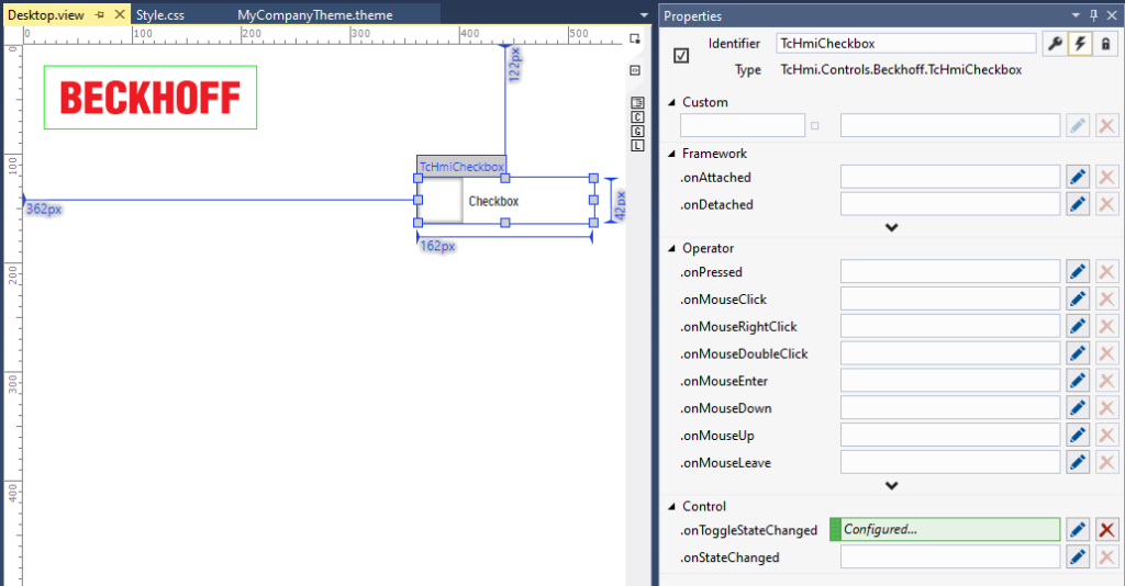
The event will have simple logic. If the checkbox is checked (Active), than move Beckhoff logo a little bit down. Else go back to its original position.
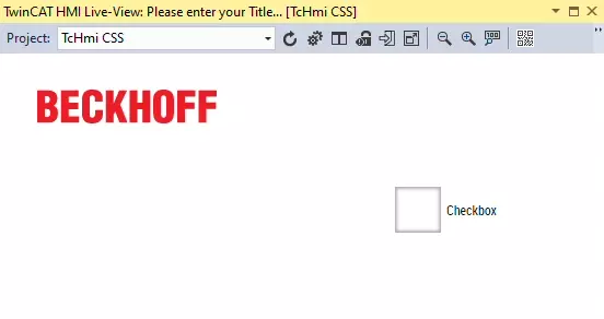
If you will start Live-View now and try it, the logo should move upon change of the checkbox state.
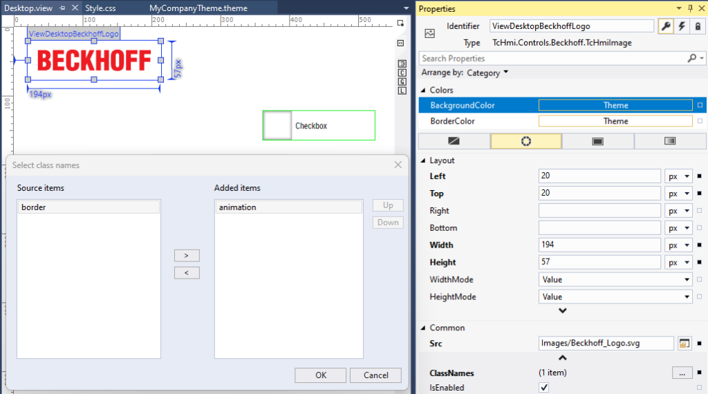
Now we will add our animation class to the ClassNames of the logo.
If you repeat the test now, the movement should be animated. You see it is not that hard. Aside of animation you can change element background, font, colors, borders or whatever can be changed with CSS.
Changing CSS of default TwinCAT Controls
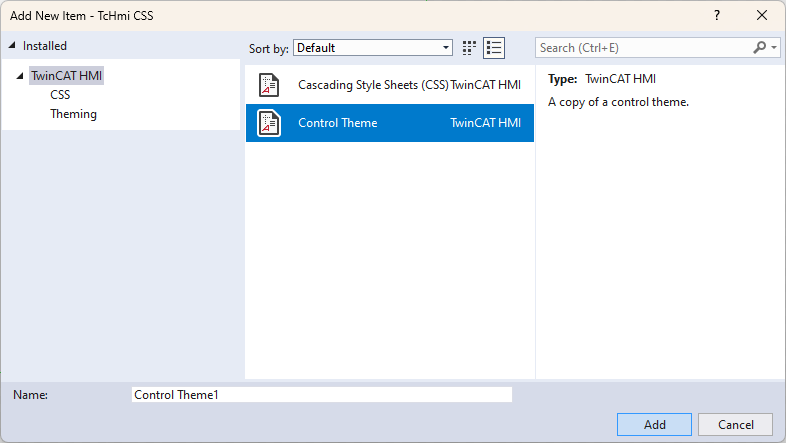
There is a very easy way to get the CSS rules of the base TwinCAT HMI controls so you can change them. Right click your theme, then go to Add -> New Item… and select Control Theme.
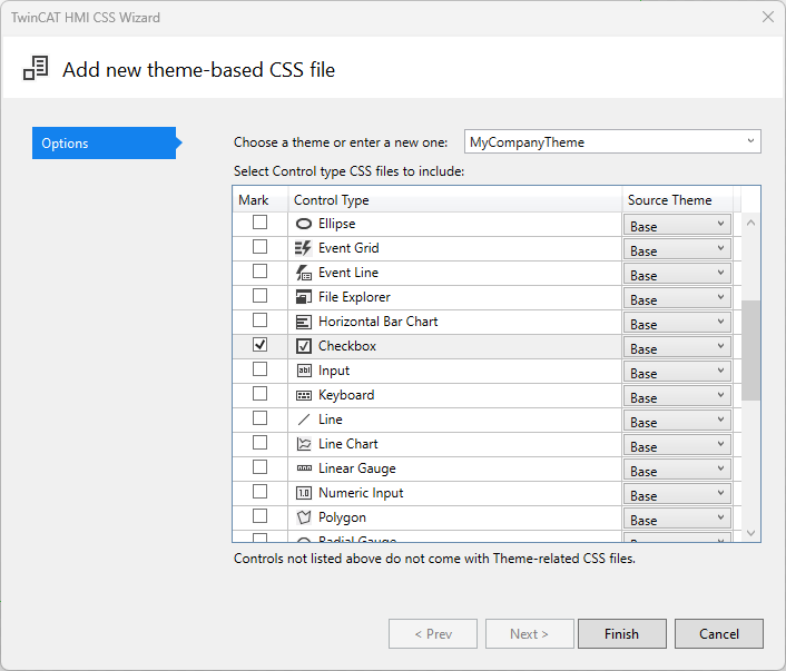
Here you can choose all the controls you would like to edit CSS in and click Finish. It will create separate folder for each individual control you have selected containing its CSS styles and graphics.
Open the Style.css file of your desired control and here you will see all the CSS rules that format its look. That’s actually neat IMHO.
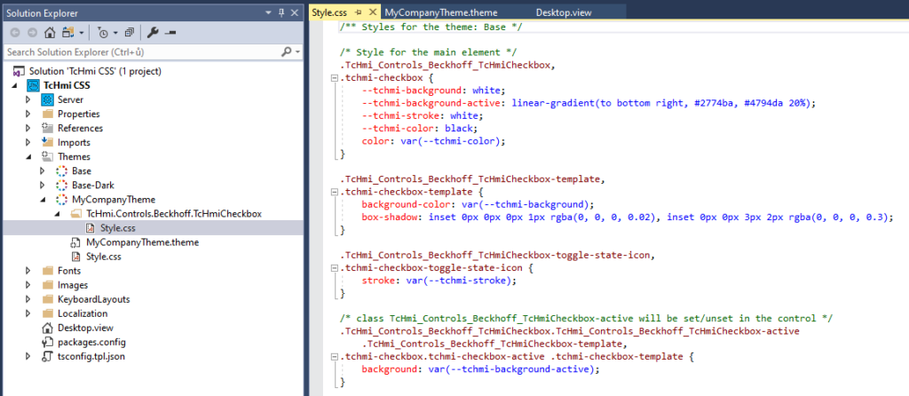
You can change existing CSS properties, remove them or add new or even add whole new rules. There may be a lot of things to change so try to play around and change parameters to learn to orient in HMIs class names.
You can return the file to default by adding it again…it will ask you to overwrite current version.
Changing unchangeable
*This chapter is based around using developer tools in web browser to find proper CSS selectors.
There are still few things which you cannot find and change even when using the tools in the last chapter. For this purpose we will use very handy tool in developing this web based HMI which is web-browser developement tools.
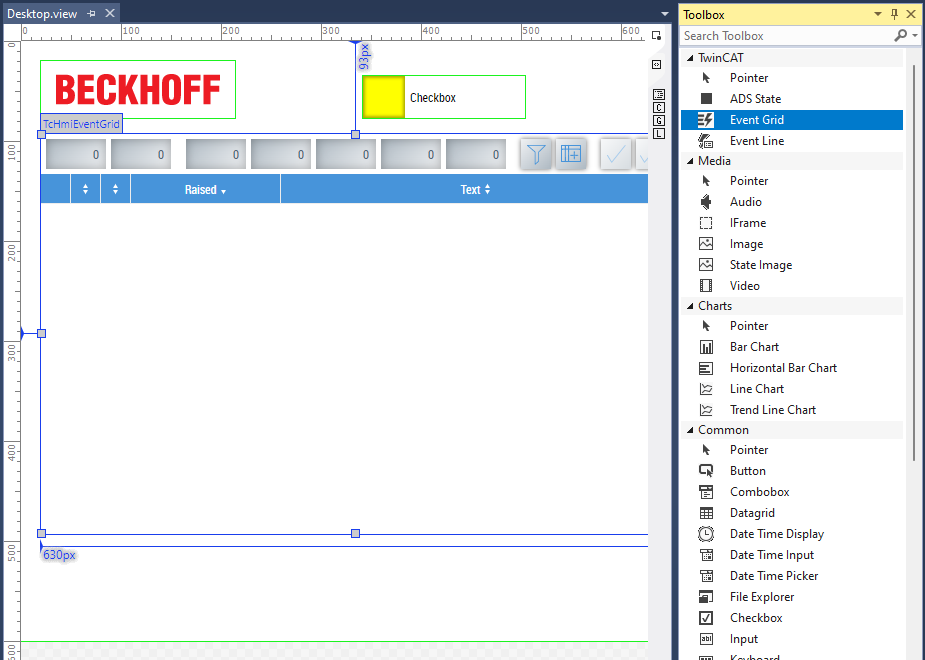
One of those things you can not change using previously introduced tools and one of those things that customer will probably ask for is when you are using TwinCAT Event Logger, the HMI Event Grid draws all the event types in the same color. You can only differ between them using the small icon on the left. Let’s make this control easier to read and color whole lines based on what type of event is in there.
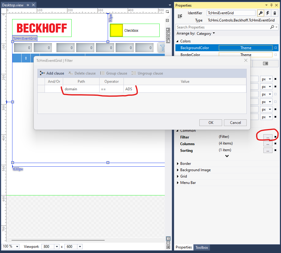
So let’s start by adding Event Grid to our Desktop. Set filter to domain == ADS so we can see some events without having to create whole PLC project, create Event Classes and raise events.
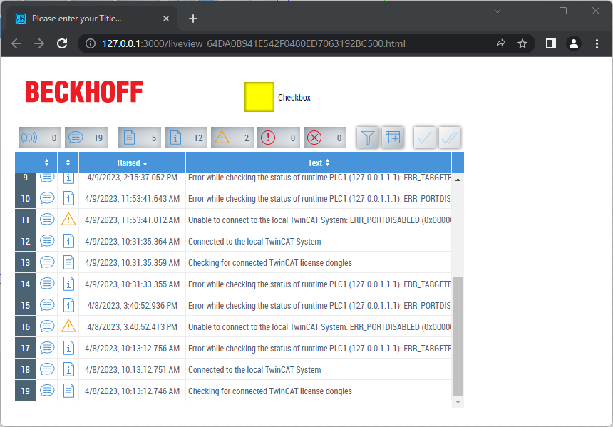
When you are done open Live-View in web browser and you should see couple of system events.
*If you don’t know how to do it you can learn so in the TwinCAT HMI – Your first project (project, upload, server config) tutorial.
Now let’s open the developer tools. You will probably succeed by pressing F12 on your keyboard or right-clicking to the webpage and there should be Developer tools or Inspect option. Switch to Elements tab and stretch the panel so you can comfortably see HTML and CSS at the same time.
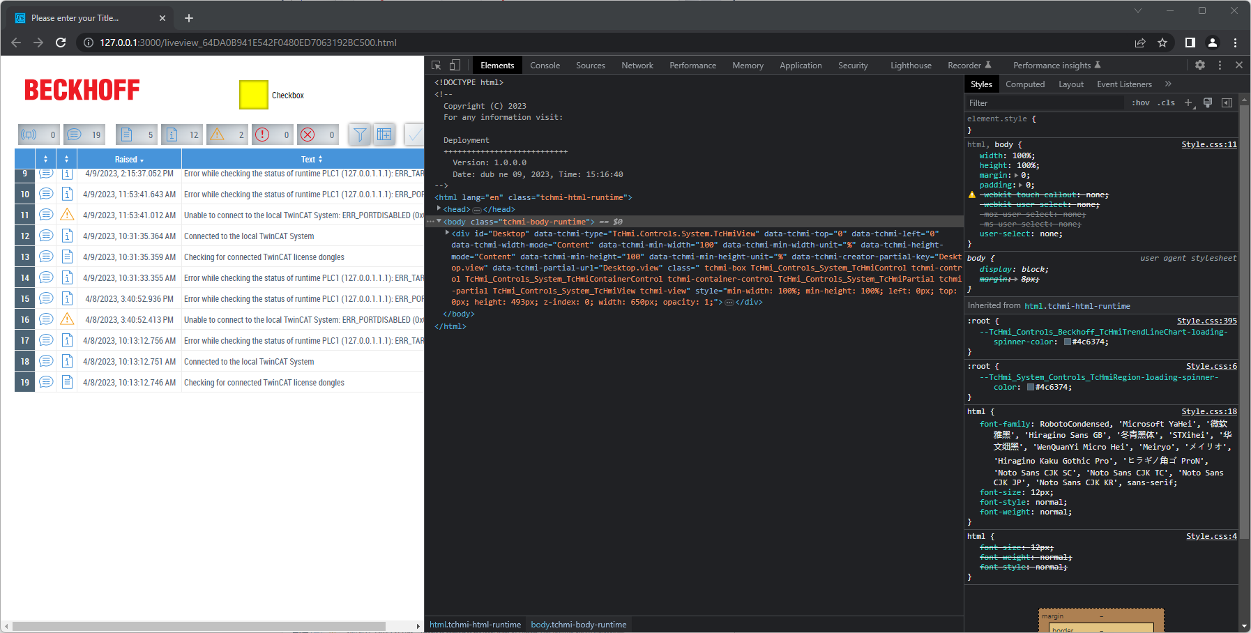
Now at the top left corner of the developer tools enable tool for element selection. Once it is enabled you can hover mouse over elements on webpage and it will higlight the in the HTML code for you. You will finish the selection by clicking on the element.
Select one row in the table and click on some element in that row. I want to highlight warnings so I will click something in a warning row.
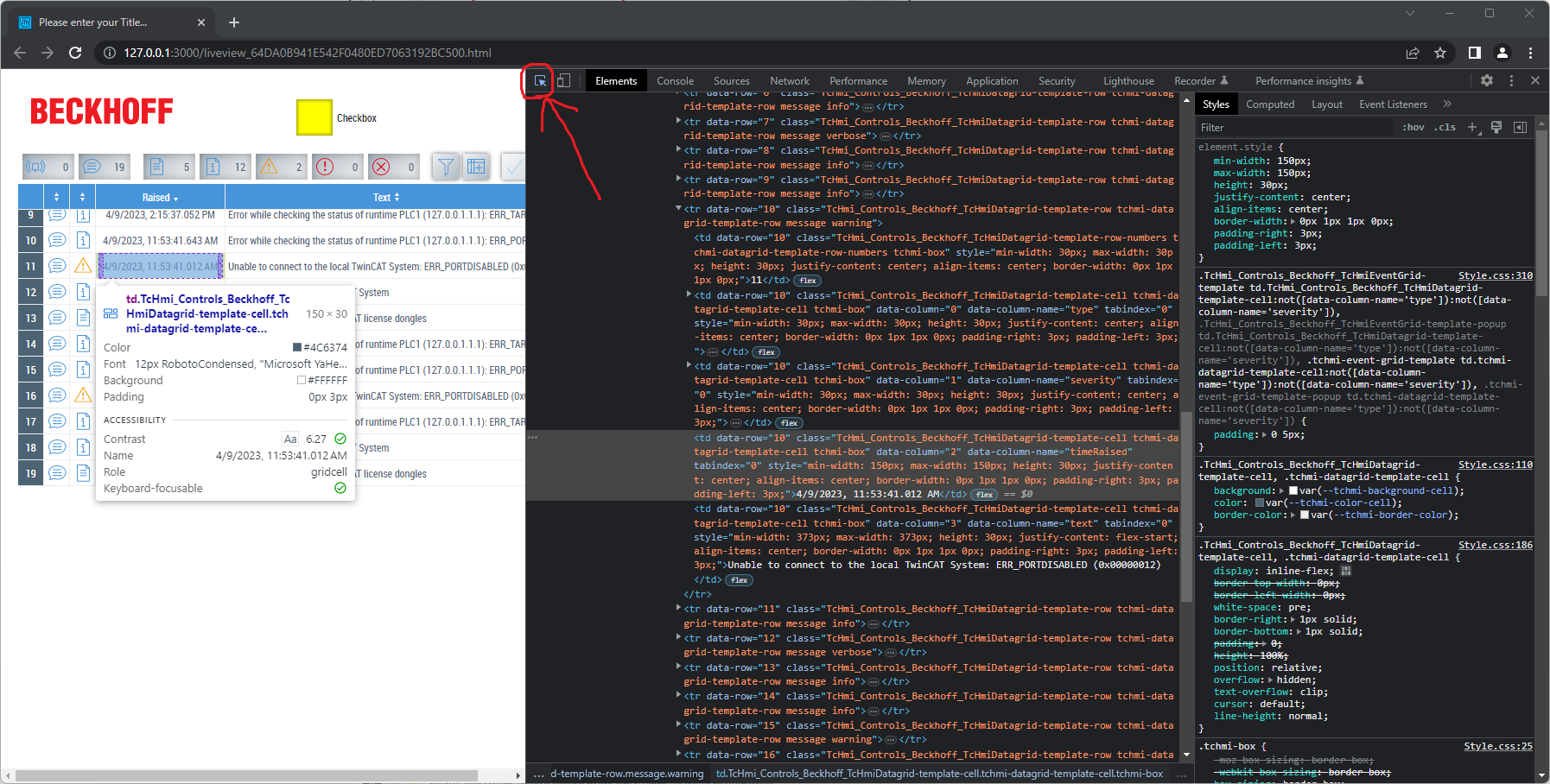
In the developer tools you can now see code for the element you have just selected. I want to color whole row instead of just that one element in a row. So I will head a few lines above in the code and select its parent element instead which is actually whole table row.
*In HTML table row HTML elements are called <tr> and table columns are considered to be data of the table so they are named <td>.
When you look closely at the classes of the row you can see that there is a class TcHmi_Controls_Beckhoff_TcHmiDatagrid-template-row defining the look of the row and there are classes message and warning identifying the type of event in the row. We will use them as a selectors for our CSS rules.
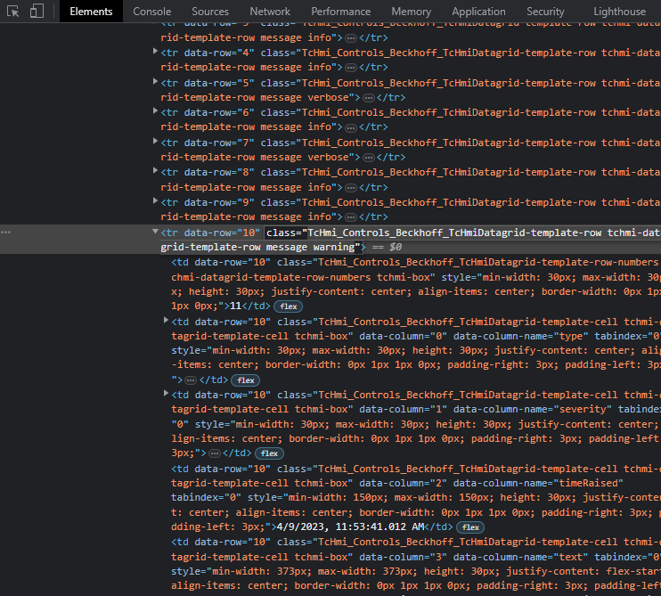
*Inspect other row classes too.
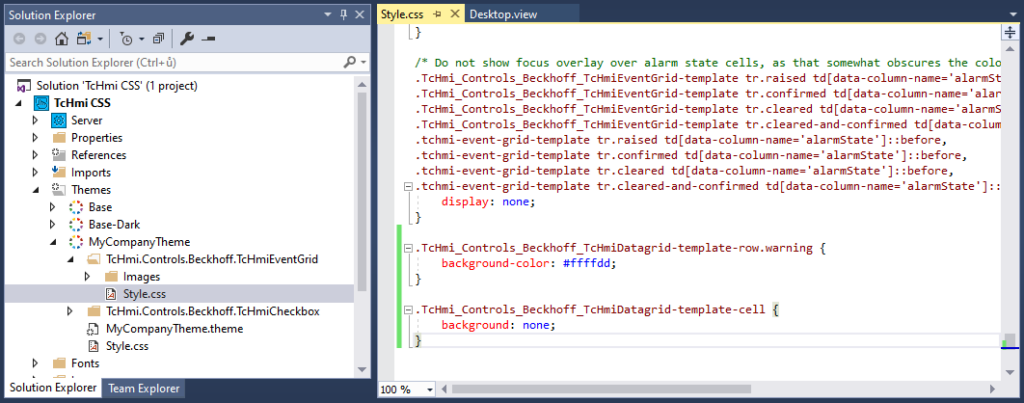
With this knowledge let’s head back to the editor. We will have to create new CSS rules and you can decide now whether you want to place new rules into the themes CSS file as we did into chapter Custom CSS for custom theme classes or into file of the control as we did in previous chapter Changing CSS of default TwinCAT Controls. I will choose second option.
So add Event Grid control to your Theme and scroll to the end of the CSS file. So we have two CSS class selectors to identify the row elements. Both are classes of the same HTML element. Se we will have to add following CSS rule with the selector:
.TcHmi_Controls_Beckhoff_TcHmiDatagrid-template-row.warning {
    background-color: #ffffdd;
}
This will set the background-color of elements with this classes combination to kind of mild yellow color.
Classes have to be prefixed with .. Read this article to find more about CSS selectors.
But when you save the file and have a look at the event table you will see no change. Why is that? Go back to developer tools and see the CSS rules for the table cells. They have their own white background so we can not see our yellow background through it.
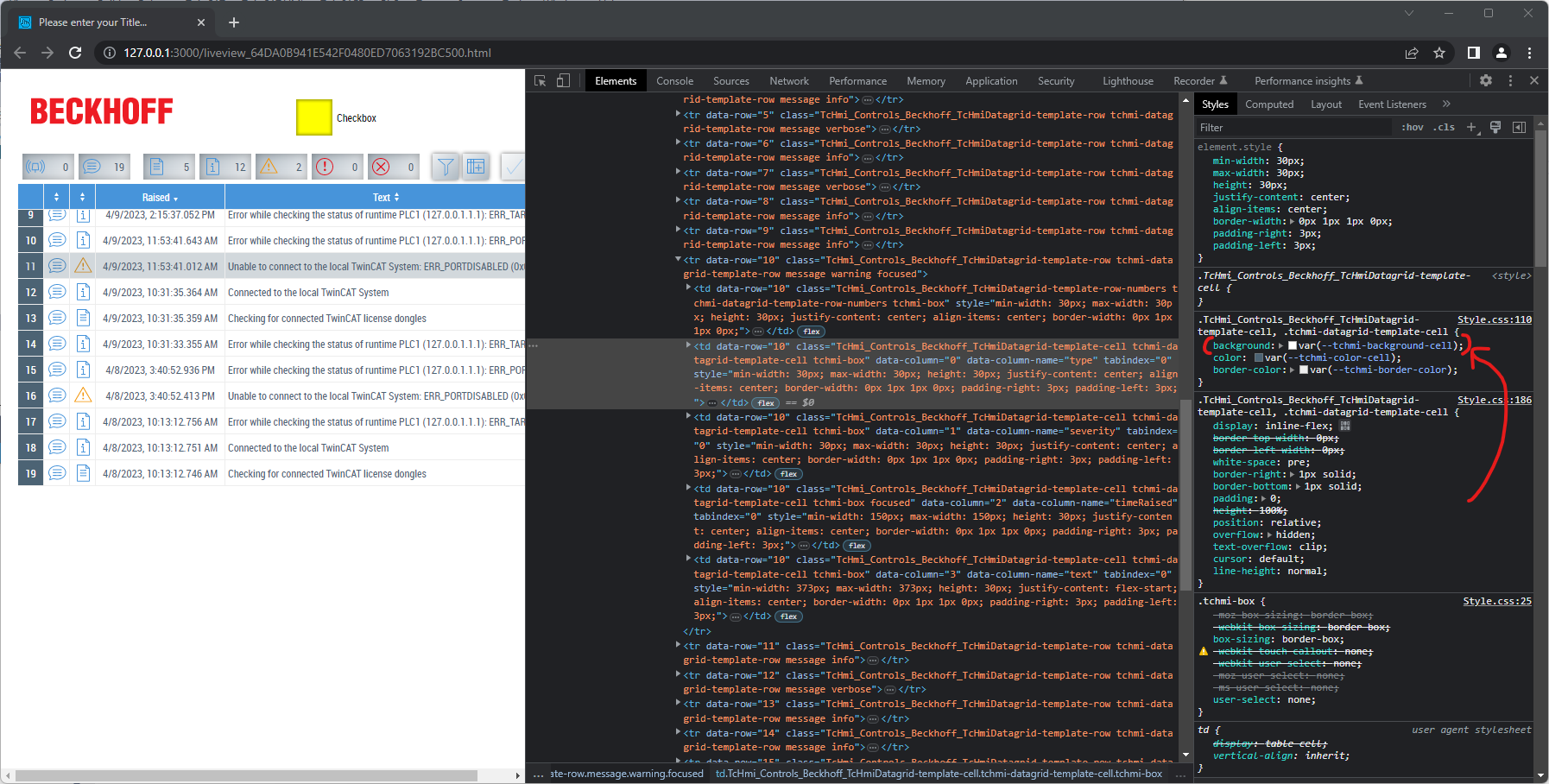
We can solve the problem by overwriting their CSS to no background like this:
.TcHmi_Controls_Beckhoff_TcHmiDatagrid-template-cell {
    background: none;
}
So your final code will contain both mentioned rules and look like on the following picture.
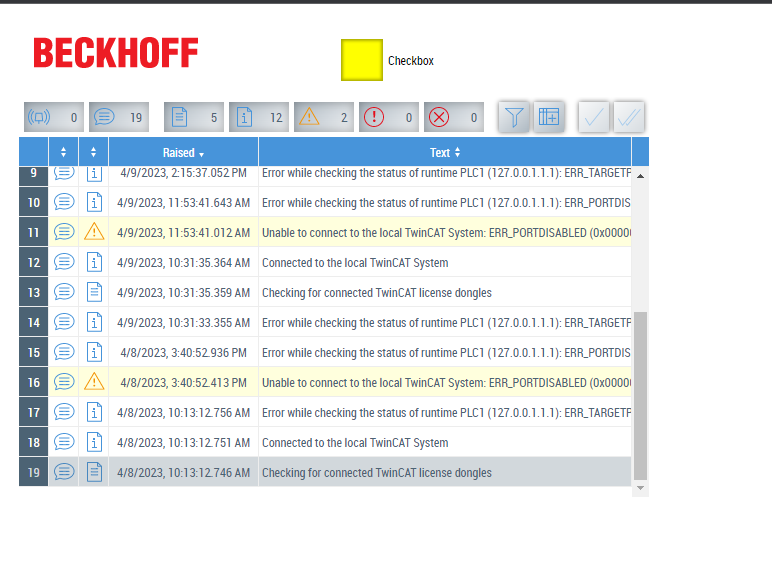
You should now have warning events with yellow background.
You can create same rules for error and critical events too:
.TcHmi_Controls_Beckhoff_TcHmiDatagrid-template-row.warning {
    background-color: #ffffdd;
}

.TcHmi_Controls_Beckhoff_TcHmiDatagrid-template-row.error {
    background-color: #ffdddd;
}

.TcHmi_Controls_Beckhoff_TcHmiDatagrid-template-row.critical {
    background-color: #ff9999;
}

.TcHmi_Controls_Beckhoff_TcHmiDatagrid-template-cell {
    background: none;
}
Finding the right selectors can be tricky in some cases so be patient and learn. The article about CSS selectors mentioned earlier and developer tools will be your friends.
Final word
HMI allows for high ability of customization and after you learn to change its CSS it’s almost endless although it can be tricky sometimes to find the right CSS selectors to select the right element. This brings you free hand in creating your custom designs and possibility to differentiate from competition.
If you like the article please give it a heart and share it. Thanks 🙂
Leave a Reply